the last letterpress ampersand

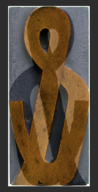
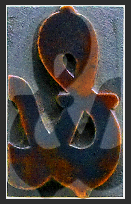
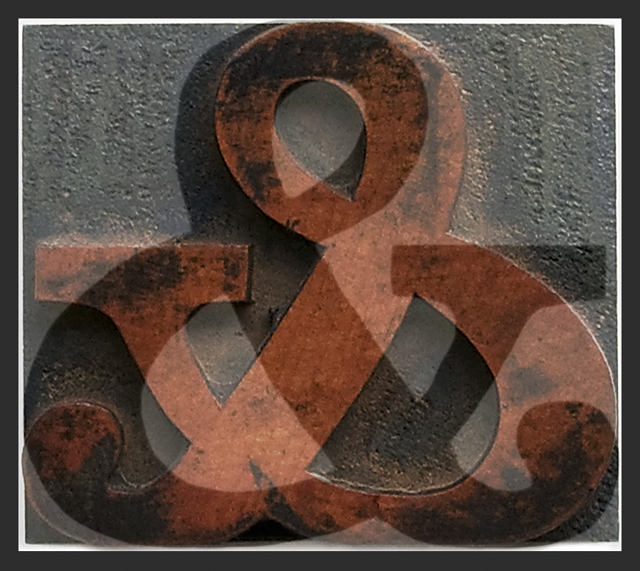
Ampersand Abstract #8, Vancouver 2010


This is the last post in my series of Ampersand Abstracts. Letterpress prints made with handcrafted wooden type blocks hold great appeal for me. In fact, I am always attracted to everyday objects from the past, be they vintage Israeli posters, old Airstream trailers, or nostalgic Canadian diners – the subject of my new series starting tomorrow.


Metal Type Drawers, Vancouver 2010

© Leslie Hossack

I love the mystery of what’s in these drawers. In the letterpress printing room, scores of drawers hold dozens of fonts. Each heavy type case houses intriguing treasures, from the largest wooden blocks lying in stately fashion in their own compartments, to the tiniest metal characters sorted into containers by letter. In 2010 when I took a letterpress printing workshop at the Emily Carr University of Art + Design in Vancouver, I became fascinated with wooden type. I spent more time in the letterpress room photographing the beautifully handcrafted blocks than typesetting.

With the abstract photographs presented here, I set out to explore the intricate relationship between contemporary photography and traditional printing. Letterpress images are printed by hand, one colour at a time, when a raised inked surface is pressed into paper. Today in the digital darkroom, photographs are still crafted one image at a time and then printed using an inkjet printer.

Of all the typographical characters that I encountered in the type drawers, the ampersand was my favourite. I photographed every ampersand wooden type block that I could find; I also printed each one by hand on a table top printer in the letterpress room. The ampersand abstracts in this series were then created in my digital darkroom by combining the original photograph of the wooden type face and a representation of what that character would look like when printed.
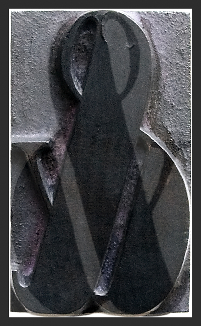
I love the mystery of what’s in the drawers.

Ampersand Abstract #7, Vancouver 2010


All the Ampersand Abstracts in this series were created from my photographs of large wood type blocks. For letterpress relief printing, metal type could not be cast much larger than an inch and still retain the flat surface required. There were a number of additional negative factors inherent in large metal type: it was expensive, it required a large amount of storage space, and it was extremely heavy. So wood type was widely used for broadsides and posters which needed large letters that could be read at a distance. For more interesting reading about wooden type, see History of Graphic Design, Poster History, which also includes over 30 examples of vintage posters with annotations.


Mixed Type Drawers, Vancouver 2010

© Leslie Hossack

I love the mystery of what’s in the drawers. In the letterpress printing room, scores of drawers hold dozens of fonts. Each heavy type case houses intriguing treasures, from the largest wooden blocks lying in stately fashion in their own compartments, to the tiniest metal characters sorted into containers by letter. In 2010 when I took a letterpress printing workshop at the Emily Carr University of Art + Design in Vancouver, I became fascinated with wooden type. I spent more time in the letterpress room photographing the beautifully handcrafted blocks than typesetting.

With the abstract photographs presented here, I set out to explore the intricate relationship between contemporary photography and traditional printing. Letterpress images are printed by hand, one colour at a time, when a raised inked surface is pressed into paper. Today in the digital darkroom, photographs are still crafted one image at a time and then printed using an inkjet printer.

Of all the typographical characters that I encountered in the type drawers, the ampersand was my favourite. I photographed every ampersand wooden type block that I could find; I also printed each one by hand on a table top printer in the letterpress room. The ampersand abstracts in this series were then created in my digital darkroom by combining the original photograph of the wooden type face and a representation of what that character would look like when printed.

Upper Case, Lower Case, Italics & Caps

Ampersand Abstract #6, Vancouver 2010


I love the mystery of what’s in the drawers. In the letterpress printing room, scores of drawers hold dozens of fonts. Each heavy type drawer hides intriguing treasures, from the largest wooden blocks lying in stately fashion in their own compartments, to the tiniest metal characters sorted into containers by letter.


Hamilton Type Drawers, Vancouver 2010

© Leslie Hossack

In 2010 when I took a letterpress printing workshop at the Emily Carr University of Art + Design in Vancouver, I fell in love with ampersands. I also became fascinated with wooden type. I spent more time in the letterpress room photographing the beautifully handcrafted blocks than typesetting. This series of images celebrates the expressive art of traditional letterpress printing.

With the abstract photographs presented here, I set out to explore the intricate relationship between contemporary photography and traditional printing. Letterpress images are printed by hand, one colour at a time, when a raised inked surface is pressed into paper. Today in the digital darkroom, photographs are still crafted one image at a time and then printed on an inkjet printer.

Of all the typographical characters that I encountered in the type drawers, the ampersand was my favourite. I photographed every ampersand wooden type block that I could find; I also printed each one by hand on a table top printer in the letterpress room. The ampersand abstracts in this series were then created in my digital darkroom by combining the original photograph of the wooden type face and a representation of what that character would look like when printed using black ink.

ampersand abstracts

Ampersand Abstract #5, Vancouver 2010

© Leslie Hossack

The ampersand abstracts in this series were created in the digital darkroom by combining my original photograph of the wooden type face and a representation of what that character would look like when printed using black ink. Below you can see my original photograph of the type block, and the digital representation of what it might look like when printed using a letterpress printer.

Wooden Type Block & Print

I fell in love with ampersands in 2010 when I took a letterpress printing workshop at the Emily Carr University of Art + Design in Vancouver. There I became fascinated with wooden type. I spent more time in the letterpress room photographing the beautifully handcrafted blocks than typesetting. This series of images celebrates the expressive art of traditional letterpress printing.

With the abstract photographs presented here, I set out to explore the intricate relationship between contemporary photography and traditional printing. Letterpress images are printed by hand, one colour at a time, when a raised inked surface is pressed into paper. Today in the digital darkroom, photographs are still crafted one image at a time and then printed on an inkjet printer.

Of all the typographical characters that I encountered in the type drawers, the ampersand was my favourite. I photographed every ampersand wooden type block that I could find; I also printed each one by hand on a table top printer in the letterpress room.

ampersands have acquired a certain caché

Ampersand Abstract #4, Vancouver 2010

© Leslie Hossack

For me, the ampersand is the most engaging of all font characters. Clearly it has inspired typography designers and graphic designers alike to be creative and downright playful. Even the word “ampersand” itself seems to have acquired a certain caché.

I fell in love with ampersands in 2010 when I took a letterpress printing workshop at the Emily Carr University of Art + Design in Vancouver. There I became fascinated with wooden type. I spent more time in the letterpress room photographing the beautifully handcrafted blocks than typesetting. This series of images celebrates the expressive art of traditional letterpress printing.

With the abstract photographs presented here, I set out to explore the intricate relationship between contemporary photography and traditional printing. Letterpress images are printed by hand, one colour at a time, when a raised inked surface is pressed into paper. Today in the digital darkroom, photographs are still crafted one image at a time and then printed on an inkjet printer.

Of all the typographical characters that I encountered in the type drawers, the ampersand was my favourite. I photographed every ampersand wooden type block that I could find; I also printed each one by hand on a table top printer in the letterpress room. The ampersand abstracts in this series were then created in my digital darkroom by combining the original photograph of the wooden type face and a representation of what that character would look like when printed using black ink.

warning: ampersands can be addictive

Ampersand Abstract #3, Vancouver 2010

© Leslie Hossack

Warning: ampersands can be addictive. Within any given font set, ampersands are the most creative and intriguing characters. Once you start to look at the design of a few ampersands, you’ll want to see them all. An easy way to view the ampersands available on your computer is to click here, if you have flash. VERY COOL. Thanks to simplebits.com for posting this tidbit from Gabe.

I fell in love with ampersands in 2010 when I took a letterpress printing workshop at the Emily Carr University of Art + Design in Vancouver. There I became fascinated with wooden type. I spent more time in the letterpress room photographing the beautifully handcrafted blocks than typesetting. This series of images celebrates the expressive art of traditional letterpress printing.

With the abstract photographs presented here, I set out to explore the intricate relationship between contemporary photography and traditional printing. Letterpress images are printed by hand, one colour at a time, when a raised inked surface is pressed into paper. Today in the digital darkroom, photographs are still crafted one image at a time and then printed on an inkjet printer.

Of all the typographical characters that I encountered in the type drawers, the ampersand was my favourite. I photographed every ampersand wooden type block that I could find; I also printed each one by hand on a table top printer in the letterpress room. The ampersand abstracts in this series were then created in my digital darkroom by combining the original photograph of the wooden type face and a representation of what that character would look like when printed using black ink.

ampersands: a creative combination of E & T

Ampersand Abstract #2, Vancouver 2010

© Leslie Hossack

An ampersand (&) is a written character that represents the word “and” in both printed text and handwritten script. The ampersand symbol is a ligature of the two letters, E and T,  found in the Latin word et, which means “and” in English.

The ampersand can be traced all the way back to the first century AD. If you look at a variety of modern ampersands, you may still be able to make out the creative combination of the letters E and T in certain fonts.

In 2010 I took a letterpress printing workshop at the Emily Carr University of Art + Design in Vancouver. There I became fascinated with wooden type. I spent more time in the letterpress room photographing the beautifully handcrafted blocks than typesetting. This series of images celebrates the expressive art of traditional letterpress printing.

With the abstract photographs presented here, I set out to explore the intricate relationship between contemporary photography and traditional printing. Letterpress images are printed by hand, one colour at a time, when a raised inked surface is pressed into paper. Today in the digital darkroom, photographs are still crafted one image at a time and then printed on an inkjet printer.

Of all the typographical characters that I encountered in the type drawers, the ampersand was my favourite. I photographed every ampersand wooden type block that I could find; I also printed each one by hand on a table top printer in the letterpress room. The ampersand abstracts in this series were then created in my digital darkroom by combining the original photograph of the wooden type face and a representation of what that character would look like when printed using black ink.

abstracts: from Airstreams to ampersands

Ampersand Abstract #1, Vancouver 2010

© Leslie Hossack

Each day for the past week or so, I have been posting photographs of a vintage Airstream travel trailer. These images are part of my series called Airstream Abstracts. Today I am starting a new series: Ampersand Abstracts.

In 2010 I took a letterpress printing workshop in Vancouver, and I became fascinated with wooden type. I spent more time in the letterpress room photographing the beautifully handcrafted blocks than typesetting. This series of images celebrates the expressive art of traditional letterpress printing.

With the abstract photographs presented here, I set out to explore the intricate relationship between contemporary photography and traditional printing. Letterpress images are printed by hand, one colour at a time, when a raised inked surface is pressed into paper. Today in the digital darkroom, photographs are still crafted one image at a time and then printed on an inkjet printer.

Of all the typographical characters that I encountered in the type drawers, the ampersand was my favourite. I photographed every ampersand wooden type block that I could find; I also printed each one by hand on a table top printer in the letterpress room. The ampersand abstracts in this series were then created in my digital darkroom by combining the original photograph of the wooden type face and a representation of what that character would look like when printed using black ink.